Monday, December 7, 2015

Eric Natzke

Eric Natzke is a graphic designer who is considered one of the pioneers of computer generated art. The medium he uses to create his artwork is computer code. He has been known to push back the limits of his medium by taking risks with original and innovative methods. In result, he has discovered new approaches to linking art and design with technology and attempting to blur lines between technology and creativity. 

Natzke is a both an artist and a programmer, and he combines his design skills with his programming skills to create incredible works of digital art. He is concerned both with aesthetics and methodology in creating his work, and generates beauty through code and numbers. When he goes to draw something, Natzke does not pick up a pencil like most people. Instead, he goes to his Flash software editor and begins to write his own code. He writes up the codes he will use as the tools--the pencils--to create his art. And so he controls the path his art will eventually take at this very first stage of the process: the coding. In this stage of the process he shapes every single last detail in the coding before finally taking a step back to watch his code being executed. And this is how he creates his artwork.

More than anything, Natzke is obsessed with color. Color, along with nature, is one of his biggest inspirations and themes. When he codes his artwork, he does not only code his tools and the formations that result; he creates his own colors through coding. This is his process: he steps out of his studio into his garden and snaps a photo of a flower. He then sits down and, instead of relying on existing tools for creating digital color (traditional palettes are not sufficient for Natzke), he reaches directly into the source code. “Like a contemporary alchemist” he creates the colors from the photograph that he needs. In summary, he captures color schemes from his photography of nature and creates shapes and compositions via code.

Natzke explores abstract textures and uses nature as an inspiration to create similar impressions of it on a digital canvas. This can be seen by the works from his Colors of Nature exhibition (examples of which are shown throughout this blog post). He explains this inspiration in an interview, stating, “There are lots of similarities between just how nature likes to germinate a flower with so many different petals, and its repeated forms and structures. I look at it almost like they're algorithms. A flower is generated by a system of instructions. Similarly, that's how I look at code: as a system of formulas that I have control over that generate a resulting outcome, or a generative system.”

Armed with his numbers, codes, and processes, Natzke attempts to create bridges. His work serves as a bridge between impressionism and expressionism. His work is impressionist in its emphasis on color instead of the subject, and then expressionist in the dynamic form of his art. He is an impressionist by representing nature and an expressionist with his abstract style. Along with this combining of styles, Natzke also attempts to from a bridge between the physical and digital world--through color. He believes that there is a friction etween design and technology, and with his art he attempts to break that down. This is the central aim, even the central meaning, behind his work. 

I have only recently discovered the works of Eric Natzke, but since I first saw one his digital works, I was entranced. I could hardly believe that it was digitally done. The simulated texture of his art, which gave me the irrational urge to reach out and touch the screen even though I knew it was impossible to actually feel anything, look so much like painted brush strokes. I was simply speechless. His art is so beautiful and, in my opinion, so interesting in how it closely it resembles paint and seems to have a texture. I think this is my favorite part of Natzke’s art, and why I was so intrigued by it. 


Once I began to look more into him and how he develops his art, I only became more and more amazed. The fact that he creates all his own coding, even for each individual color he uses, was mind-blowing. I can’t imagine how much effort something like this must take, and this just proves how dedicated and skilled Eric Natzke is. What makes his art so magnificent  is that it is not just aesthetically pleasing, but the fact that he puts in all the effort to make it completely his own. This is why I believe his artwork is so beautiful. 


Lilo & Stitch


Lilo & Stitch is an American animated film released in 2002 by Walt Disney Pictures. It was written and directed by Dean DeBois and Chris Sanders and was the first ever animated film to taken place on a Hawaiian island. According to Sanders, the decision to make Hawaii the setting of Lilo & Stitch was crucial to film: “Animation has been set so much in ancient, medieval Europe—so many fair tales find their roots there, that to place it in HawaiĘ»i was kind of a big leap. But that choice went to color the entire movie, and rewrite the story for us.” Even outside the realm of animation, a very small number of films had been made about Hawaii. Lilo & Stitch is one of the only films to be centered around the culture of Hawaii and has been described as capturing the true essence of Hawaii on screen. 

Lilo & Stitch tells the story of a young girl named Lilo who, even though it is a Disney animated movie, faces very real problems. The root of her problems are not some plot difficulty which she eventually overcomes, such as in many other Disney movies, but are extremely realistic, mature, and tragic. Lilo and her older sister, Nani, are orphans whose parents had died in a car crash not too long ago. Nani, who is only 19 and obviously inexperienced, is forced to assume the responsibilities of being a guardian, a parent-figure, to Lilo. In the midst of Lilo struggling with loneliness after her parents’ death and Nani struggling with jobs, the threat of Lilo being taken away from Nani by social services casts a shadow over the film. 

Lilo and Nani’s impoverished and dysfunctional life represented the life that many Hawaiians lived during the economic downturn at the time. The Disney animators faced the forbidding task of meshing this brutally honest plot of the film with the island’s serene beauty. The accomplished this with the use of watercolor. They chose to deviate from the traditional gouache techniques of their earlier Disney features and used watercolor painted backgrounds for Lilo & Stitch, and this evokes the bright look of a storybook. 

The Hawaiian concept of ohana, which is mentioned and exemplified in the scenes I picked to represent Lilo & Stitch, is the most central theme of Lilo and Stitch. Although ohana ultimately came to be the prevailing message of the film, it was not a part of the original story. Then the animation team visited Kaua’i to do research and they were introduced to the term. DeBois has said, “No matter where we went, our tour guide seemed to know somebody. He was really the one who explained to us the Hawaiian concept of ohana, a sense of family that extends far beyond your immediate relatives. That idea so influenced the story that it became the foundation theme, the thing that causes Stitch to evolve despite what he was created to do, which is destroy.” 

The theme of ohana meaning family is repeated throughout the film, but the writers seemed to stop with “family” in their explanation of this immensely complex idea. Instead of explicitly explaining the concept in full detail, the movie demonstrated it by scenes such as this one. 

Lilo comes from a broken home, and the character of Stitch becomes a much-needed, somewhat bizarre antithesis to the shockingly realistic and heartbreaking circumstances of Lilo’s life. In this scene we see Stitch as an outsider looking in to a beautiful relationship between sisters, but later we see him being offered a chance to be a part of the family by Lilo. This demonstrates the fundamental of ohana, which is that it can extend far, far beyond immediate family. The writers let the movie itself convey this crucial message.

One of the most unique and original aspects of the film was its strong focus on the relationship between Lilo and Nani, which is also exemplified by this scene. The relationship between two sisters is not typically the focal point in American animated films, and this demonstrates Disney becoming more progressive. In this scene, Nani attempts to tell Lilo that the next day Lilo will be taken by social services. In other words, the two of them, the last remains of their family, will be separated. 
She cannot find the words to tell her such devastating news, and so she sings her a song titled “Aloha ‘Oe”, which translates to “Farewell to Thee”. This song is by Hawaii’s last monarch and the only queen regent of the Kingdom of Hawaii, Queen Liliuokalani. She wrote this song while she was imprisoned after her home land had been taken over by western industrialization. She wrote this song to apologize to her people and country for being unable to protect them and uphold her duties as Queen. With this context in mind, it is likely that Nani was singing this song to Lilo because she was could not protect her from what was to come and felt as if she failed Lilo like the Queen had failed her country.
Nani and Lilo’s relationship, which had been strained so greatly and yet remained so strong, defines the movie for me. It is most likely why I love this movie so dearly. This is one of Nani and Lilo’s most heart-wrenching and beautiful scenes together, and I feel that is represents what the movie is all about. It is extremely sad, but it is powerful in its depiction of a bond that cannot be severed regardless of whatever hardship comes its way. It is also so heartbreaking so see Stitch’s position as an outsider in this scene, but equally as powerful. Seeing how much love exists between the two sisters, Stitch realizes he has never been loved that way and feels very alone. Even when he is offered a chance to experience such unconditional love, he is too afraid to accept it. The reason why this is probably so powerful is because his feelings are relatable. We have all felt like Stitch at least during one point in our lives. 
I also love Lilo and Stitch because of how it is such a drastic change from many other Disney movies. Yes, it eventually has a happy ending, but the sorrow felt by the characters is so mature and realistic that this movie cannot be put in the same category with “fairy-tale endings”. It is not just a silly cartoon with weird-looking aliens. It holds deep truths and conveys them so beautifully with scene such as this one, and that is what makes Lilo & Stitch so worthwhile.


Sunday, December 6, 2015

Sleeping at Last - Atlas:Year One


Sleeping at Last is best described as a musical project led by the singer-songwriter and multi-instrumentalist Ryan O’Neal. It was originally formed in 1999 as an alternative-rock band based out of a suburban Chicago (Wheaton, Illinois) of three people, with Ryan O’Neal as the lead vocalist and guitarist, his brother Chad O’Neal as the drummer, and Dan Perdue as the bass player. Following the release of their first four albums, Chad O’Neal and Dan Perdue eventually left the band to pursue other interests. Ryan O’Neal chose to continue with his musical career and decided to keep the band’s name for his solo work. He continues making music to this day, but starting in 2011 with his 36-song project “Yearbook”, he has abandoned the industry standard of releasing an album every other year. Now he focuses on single songs and short EPs rather than traditional albums. In 2013, he began an extensive concept project, Atlas, which is an ongoing series of new music (consisting of EPs, singles, etc.) to be released over the course of several years. Atlas: Year One, which consists of 30 songs, was completed in early 2014, with songs and EPs having been released throughout 2013 until then. Currently, Sleeping at Last is working on  Atlas: Year Two

What started as an alternative band has progressed into a musical project that encompasses characteristics from not only alternative rock and indie rock, but a variety of other genres as well. One of these genres is “baroque pop”, a subgenre of pop rock which infuses rock and roll with elements of classical music. Another is “emo”, which is a style of rock music characterized by expressive, oftentimes confessional, lyrics. These descriptions of genre are useful is understanding the music of Sleeping at Last and Atlas.

O’Neal uses the freedom of his ongoing project, which has no deadline, to explore abstract themes of human existence through a musical perspective. In an explanation of his concept, O’Neal has wrote, “i wanted to create a project that allowed me endless room for exploration musically and thematically, while still coloring within the lines of an overarching theme. atlas gives me exactly that. the theme of “atlas” is the exploration of the origins, emergence and experiences of life.”

Each and every one of his songs has considerable thought behind it and is centered around lyrics with profound, heartfelt meaning. O’Neal gives detailed explanations of all his songs on the Sleeping at Last website, demonstrating the incredible thought and inspirations that go into his music. To express the deeper meanings of his songs, his lyrics rely heavily on symbolic language. Even O’Neal’s explanation of how to understand the concept is itself metaphoric and ambiguous: “imagine a camera lens pulled back as far as possible away from the universe. now imagine that lens being pulled closer and closer to us. that is the heart of atlas.” This is what he means: Atlas starts at the very beginning of the universe with an EP titled “Darkness”. It then goes onto the EP titled “Light”,  then “Space”, then “Land”, and so on.

 All of the individual songs in an EP touches upon a certain theme, and in an effort to explore such vast and incomprehensible topics, each song comes at its theme at a different angle. O’Neal describes this, saying that, “the songs for each ep will be inspired by their given theme from many different angles. for instance, the first ep, “darkness,” gives me an opportunity to explore interpretations of what darkness is: it’s the unknown, it’s blindness, it’s sorrow, it’s loss, but also it’s beginnings.” 

The opening track of “Darkness”, Overture, epitomizes Sleeping at Last’s beautifully metaphoric language with one crucial line: even with all our history, we barely caught a glimpse of what it means, in the architecture of the soul, the universe began with our eyes closed.” These lyrics represent what the project is about: exploration-- not just the exploration of themes but all of human exploration. We, as individuals and as a race, began our existence by knowing nothing, or “with our eyes closed”. And so, with this project, Sleeping at Last continues to explore through introspective lyrics and transcendental sounds created by the variety of instruments.

The artwork of Atlas, done by Geoff Benzing, is a crucial part to the project. He has done a painting for each EP and each song in Atlas and provides a visual element to the project. Some of this artwork has been featured in this blog post.

Sleeping at Last is one of my favorite artists. I fell in love with his music right from the beginning, especially the songs in Atlas: Year One. I believe a large part of the reason for this is because I found his voice absolutely magical. That was initially what drew me to Sleeping at Last, but soon I realized my love for the music was based upon three aspects equally: his melodic, emotional voice, his sincere lyrics, and the sounds created by the instrumentals themselves. All of these aspects are interwoven together to produce extraordinarily beautiful effects.

My favorite song of Sleeping at Last, which I haven’t yet discussed for reasons I will mention, is Saturn. While I have always appreciated the beauty and essentiality of instrumentals, I have never been particularly inclined to listen to only instrumentals without lyrics. Usually I cannot concentrate on the music and my mind wanders. My first time hearing the song Saturn, though, I was inexplicably focused the entire time, intently listening to every new instrument that arose and the effect they caused. Then, something that was extremely unexpected to me occurred in the song, and I was entirely taken aback. I will not discuss the details of the song here due to the risk of spoiling the first experience of the song for anyone (even though there is no guarantee the experience will be the same), but O’Neal’s choice to write the song in this way created an effective emphasis on a specific portion of the song. The result was extremely powerful for me, and because of this Saturn became a defining song of Atlas: Year One for me. 


The Book Thief

"So many humans.


So many colors.

They keep triggering inside me. They harass my memory. I see them tall in their heaps, all mounted on top of each other. There is air like plastic, a horizon like setting glue. There are skies manufactured by people, punctured and leaking, and there are soft, coal-colored clouds, beating like black hearts.

And then.

There is death.

Making his way through all of it.

On the surface: unflappable, unwavering.
Below: unnerved, untied, and undone.

In all honesty (and I know I’m complaining excessively now), I was still getting over Stalin, in Russia. The so-called second revolution---the murder of his own people.

Then came Hitler.

They say that war is death’s best friend, but I must offer you a different point of view on that one. To me, war is like the new boss who expects the impossible. He stands over your shoulder repeating one thing, incessantly: “Get it done, get it done.” So you work harder. You get the job done. The boss, however, does not thank you. He asks for more.

Often, I try to remember the strewn pieces of beauty I saw in that time as well. I plow through my library of stories.

In fact, I reach for one now.

I believe you know half of it already, and if you come with me, Ill show you the rest. Ill show you the second half of a book thief.

Unknowingly, she awaits a great many things that I alluded to just a minute ago, but she also waits for you.

Shes carrying some snow down to a basement, of all places.

Handfuls of frosty water can make almost anyone smile, but it cannot make them forget.


Here she comes."


The Book Thief is a novel written by Markus Zusak that is centered around the life of a young German girl named Liesel Meminger. The story is set in Germany from the years 1939-1943 in the historical context of World War II and the Holocaust.  

Markus Zusak, grew up listening to the stories of his parents who grew up in Austria and Germany during WWII. These stories had a huge influence on Zusak and his writing of The Book Thief. Two real-life events in particular were his biggest inspirations: the bombing of Munich and an incident his mother had witnessed of a boy running up to an old Jewish man struggling during the march to a concentration camp. Zusak has said that this story represented for him everything beautiful and everything horrible about humanity, and these ideas about horror and beauty are at the foundation of The Book Thief.

While there is a tremendous amount of literature and films out there that are about the Holocaust, this novel is extremely unique with both its story and its telling of it. The story is not technically considered a Holocaust novel because it does not focus on the Holocaust itself or the horrors of the concentration camps. Even though these events are by no means ignored in the novel, the Holocaust is mainly a backdrop for understanding a young girl’s life and her struggles with her adopted family to avoid the notice of the Nazis. In an interview, Zusak described his motivations for writing a sympathetic portrayal of a German family during the Holocaust, explaining that, “We have these images of the straight-marching lines of boys and the ‘Heil Hitlers’ and this idea that everyone in Germany was in it together. But there still were rebellious children and people who didn’t follow the rules and people who hid Jews and other people in their houses. So there’s another side to Nazi Germany.”

This particular passage illuminates themes of mortality and the power of words explored by the novel, and evokes sympathy for a surprising character: Death.


What makes The Book Thief such a unique and memorable story is that it’s told from the point of view of Death. This is the most powerful tool Zusak uses to communicate his themes about mortality. Death as the narrator is an extremely risky choice for an author to make, but Zusak manages to make it work with not just any story, but a Holocaust story. Zusack’s writing style is lyrical, poetic, and hauntingly profound. He uses intense and vivid imagery, and he personifies Death as a lonely, haunted being who spends time contemplating and wondering at human nature. 

Not only does this passage give insight into this major theme, but it is one of the most poignant depictions of Death as a compassionate and sympathetic narrator.
It shows his deep compassion for humanity and his sorrow over the pain he causes by demonstrating how tortured he is by the memory of “so many humans” and “so many colors”. 

We imagine death as a horrible thing, and most of us are afraid of it, but this passage paints a unique portrayal of Death as equally being afraid and tormented by humans. He describes himself as seeming to be cruel and relentless, but on the inside he actually feels “unnerved, untied, and undone.” He describes War not as his friend but as his demanding boss, and his tone is one of incredible remorse. This powerful metaphor invokes sympathy for someone who is just doing their job. It is ironic how Zusak manages to make the reader feel sympathy for Death itself, who brings humans so much sorrow.

In this passage, Death is describing his experiences with the Holocaust, which he is constantly forced to watch. Even though he is endlessly surrounded by destruction and sorrow, Death describes his desperate attempts to search for “strewn pieces of beauty”. One way he finds beauty is through stories, and this is another major theme of the book: the power of written word. Throughout the entire novel, even seen by the title itself, words and stories have tremendous value and influence. This passage shows that, in essence, this entire novel is about Death’s efforts to comfort himself with the story of Liesel Meminger, a young German child. With everything Death is forced to experience, this emphasizes the strength and the healing power of words.


This is one of my favorite passages from one of my favorite books. I find it so beautiful because it represents Death’s true character (in this novel) extremely well. For me, out of all the amazing aspects of the book, Death being used as the narrator is the book’s defining characteristic, and why I chose this passage to represent The Book Thief. He shows human nature through a perspective that is seldom seen. There is much room for error with telling a story through Death’s point of view, but Zusak did such an incredible job with it. In result, the story is sad but not a bleak view of the Holocaust.

What made me choose this particular passage over all the other passages in the novel is the beauty of the words and imagery used. Zusak masterfully paints an incredibly vivid and poetic picture of the tragic events of the Holocaust, and the reader can practically hear the desperation in his tone as Death talks about them. When he describes “skies manufactured by people, punctured and leaking” and “soft, coal-colored clouds, beating like black hearts”, he is speaking about the smoke from gas chambers, and this is such a powerful image.

Even though this excerpt is extremely sad and powerful, it is not morbid. The passage ends in a hopeful note, and the tragic events described so vividly at the beginning are contrasted with the story of Liesel he uses to comfort himself with. He describes an uncomplicated, even silly image of her carrying snow to the basement, and this is so beautiful to me because  it shows innocence and beauty in the midst of horror.


The Lloyd's Building

The internationally renowned Lloyd’s building in London is home to the Lloyd’s of London, one of the world’s largest and oldest insurance companies. It is located on Lime Street, London’s main financial district, and was built on the site of the first Lloyd’s building that was constructed in 1928. Due to the expansion of the insurance company’s market in 1958, more space was required to accommodate the rapidly growing business. In result, the first Lloyd’s building was demolished and the new one was constructed in its place in response to the demand for floor space that the previous office could not accommodate.


The architect for the current Lloyd’s building was Richard Rogers, and his innovate design for the building brought it instant fame since its 8-year construction from 1978 to 1986. It became a recognized example of “high-tech” style, and has been described by Historic England to be “universally recognized as one of the key buildings of the modern epoch.” It is certain that the Lloyd’s building brought a modern-futuristic architectural aesthetic to the medieval financial district of London. 

The Lloyd’s building is sometimes known as the Inside-Out Building, and this is due to its extremely unique design. The building is considered a leading example in radical Bowellism architecture in which the utilities of a building, such as its sewage pipes and lifts, are made visible on the outside. Although there is an increasing amount of buildings being designed in this style, the vast majority of buildings demonstrate a human tendency to cover up and hide what makes something work. Engineering design--the mechanical, functional works of buildings--are rarely seen. 

The construction of the Lloyd’s building does the complete opposite, choosing instead to flaunt these aspects of the building. Rogers’ design had the buildings’ functional services, such as its staircases, glass lifts, toilet pods, electrical power conduits, and water pipes on the outside. About the building, Rogers himself said, “Nothing is hidden, everything is expressed. The legibility of the parts gives the building scale and shadow.” Rogers’ design expresses the building’s emphasis on functionality. 


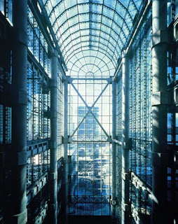
By placing everything on the outside, visible to the world, the building’s exterior is given a mechanical facade (due to its stainless steel services) while the interior space is unburdened by services and given a less cluttered feel. This uncluttered, open feel is enhanced by other aspects of the interior, such as the natural light coming through from all directions of the building as well as its atrium, which dominates the interior. Also, all the floors are linked by escalators that create internal circulation, facilitating in easy, uninterrupted communication. This adds to the open and flexible atmosphere inside.


Along with the open spatial planning that frees up the interior of the building, the design makes the building appear as if brand-new even though it was constructed more than 30 years ago. Everything in the building is exposed. If one looks closer at the picture on the right, even the escalators’ inner workings are exposed. With all of its functional systems being exposed to external elements, and because mechanical services tend to have short lives, the building constantly looks new with repair, amplifying the modern appearance created by the stainless steel. 
Even though it is described as high-tech, the Lloyd’s building incorporates aspects of the past as well. When the first 1928 Lloyd’s building was demolished, Rogers preserved parts of the original structure. Rather than demolishing all traces of the building’s history, he decided to incorporate it into his design. This creates an incredibly interesting juxtaposition between the historic architecture of the past and the modern-futuristic style of the new building. What is most interesting, though, is that the aspects of the past incorporated into the building do not appear incongruent or out of place. Rogers managed to create a design in which these two diverse styles can coexist, demonstrating the modernization of London and encapsulating the essence of the era. The building itself coexists with the historic buildings surrounding it. 

I love the juxtaposition between the historic past and modern styles of the building, because it embraces both styles in such a masterful and successful way. It shows that both aspects of human existence, the past and the future, are significant in their own ways--not that one style is better than the other.

Even though his design was largely influenced by the company's need to maximize on interior space, Rogers came up with such a creative, unique way to do so. I find the Lloyd’s building beautiful not only because the design is so interesting and stuck out to me immediately, but because the idea is so different from what one usually imagines of an important office building. There are buildings that incorporate aspects of Bowellism in their design, and the idea of exposed beams are becoming more of a trend, but the Lloyd’s building places its functional services on the outside of the building itself, which not very many buildings have done. In result, the characteristics of the building are distinctively beautiful.

Another aspect of the Lloyd’s building I found so interesting is that the aesthetic appearance of it has an unfinished quality. An example of this is that Rogers left the cranes from the construction on the top of the building as a decorative feature. This, I believe, exemplifies what the building very mush stands for: that the construction and workings of a building are as vital to it as the aesthetic designs, and that the mechanics can even become an essential aspect of the aesthetic design itself; that the engineering and the architecture of a building are intertwined, and that one part should not be hidden while the other part is seen and admired by the world. I think this was such a beautiful message he was trying to convey.